Wednesday, February 18, 2015

Hiroshige and Hokusai

           In 1853, American Matthew C. Perry led a naval fleet into Tokyo Bay and forced Japan to ally itself with the American Army. It was the last decades up until this day that marked the last years of non-international Japanese History, a time in which Japanese art and lifestyles were completely different. Ukiyo-e was a nationally widespread popular genre from the 17th to the 19th centuries, it was a genre that produced many great artists such as Katsushika Hokusai and Ando Hiroshige. These artists were extremely successful painters and printmakers from the school of printmaking. Ukiyo-e was an art style popular during the great Edo period and as such was marketed towards the wealthy people of Edo during the time.
            Hokusai and Hiroshige were very similar in their lifestyles; both had periods of their lives where their artwork was made up primarily of landscape artwork not prominent in the Ukiyo-e style, and both painted the Kabuki dancers and young women that did make up the Ukiyo-e. Many people assume that Hokusai was Hiroshige’s mentor and teacher however this is exactly true, in fact I would classify them more as rivals. Although Hokusai produced much more artwork then Hiroshige it is thought the Hiroshige to be the more successful artist of the two. I saw they are rivals because rising artists in the beginning of the 19th century were improving upon the old masters of the art style like Hokusai.
            Many great series of art came from these two artists such as Hokusai’s most popular Thirty-Six Views of Mount Fuji, and Hiroshige’s Fifty-three Stations of the Tokaido. Hokusai was known by many names during his time, however he is most famously known by Katsushika Hokusai by which name he produced most of his best and most famous works at the age of 60. This contrasts Hiroshige who only took the name of his master Utagawa and reached the peek of his success in 1833 at the age of 36. 
The Great Wave - Hokusai

Self Portrait - Hiroshige

Self Portrait - Hokusai

Goten-Yama Hill - Hokusai

Full Moon Over Mountain Landscape - Hiroshige

From Fifty-Three Stations on the Tokaido - Hiroshige

Friday, February 13, 2015

The New Design of Write and the Four

As the twentieth century rolled around new forms of art were being introduced to the world. While Art Nouveau was still a dominating style in graphics artists from all disciplines looked to other forms of expressing their styles. Most of these interests were fueled by the technological and industrial advances of the time. Many artists kept in mind the fundamentals of Art Nouveau by trying to break away from the fixed design styles of natural and historical concepts and create new abstract or non-conceptual designs. Germany Scotland and Austria were the main hubs during this time for designing new styles of artwork that would portray the social, economic, and cultural changes of the time.
            One such example of this was American architect Frank Lloyd Wright, whose geometric design style focusing on spatial organization was just reaching the eyes of European designers and artists. To Wright, space was the most important element of design, this came about when he worked with his friend on a printing press. Working on the press taught him many valuable lessons about space and how negative space can be used effectively. He used blank space as boundaries that keep his work organized as well as to combined elements for his design to work together. His works during this time brought him to the head of the modern movement which influenced many others.

            In Scotland, Wright’s work was inspiring a group of individuals who would later become known as the Four. J. Herbert McNair, Charles Rennie Mackintosh and sisters’ Margret and Frances Macdonald all attended the Glasgow School of Art where they brought about a new style of geometric art influenced by Wright’s design style. Because this new style had never been seen before in Scotland, art scholars and observers were furious with the Four. Editor of The Studio however loved their boldness and traveled to Glasgow to publish articles about them reminding everyone that the purpose of design was to attract attention and that this new design style did exactly that. Through these articles the Four became revered around Europe but were very much looked past in Britain.
Mackintosh designed this poster for the Glasgow School of Fine Art,
that caused outrage among its observers.

Wright used geometric shapes in his borders as seen above.
This style was used to create eye appealing perimeters for the designer to work in.

This is an example of Wright's rectangular design used to help different
elements of the whole piece to work together more efficiently.
 

Tuesday, January 20, 2015

Writing the Renaissance

            Originally the renaissance was the time during the fourteenth and fifteenth centuries when Greek and Roman literature was reborn and looked at in a new light. Literally meaning “rebirth” or “revival” we now refer to the Renaissance as the time period taking up the space in between the medieval period and modern times. It was during this time that the writing of books and literature underwent much transformation, becoming faster to produce with the invention of the printing press.
            Originating in Venice the printing press saw much attention by printers, type designers such as goldsmith Johannes de Spira, authors, and artists who all worked together in close collaboration to print books during this time. Although he claimed originality and kept the rights, Johannes typefaces closely resembled Sweynheym and Pannartz. His monopoly over printing ended with his death which opened the way for upcoming type casters such as Nicolas Jenson, who published over 150 books and designed popular Greek, Gothic and Roman types.
            As I mentioned in my previous essay graphic design is the collaboration between art and typography, and is used in the modern world for advertisements. During the Renaissance however I would argue that printing was a new found form of graphic design. Lance Hidy found that authors during this time would use symbols that closely related Egyptian hieroglyphics to mark identify their books. This however was only a small part of what made Renaissance books pieces of graphic design. Erhard Ratdolt was highly praised for designing intricate initials and woodcut boarders featuring ornaments resembling patterns from eastern Islamic cultures. Many artists would later take this idea and expand upon it creating extremely intricate cover or title pages mainly featuring plants or flowers of some kind.
            One of the great “graphic designers” of this time was Geoffroy Tory. Tory held many professions including designer, translator, poet and author, publisher and printer. As a scholar in the art of typography and writing he is responsible for the apostrophe, the accent, and the cedilla. Separated into three books Tory’s most influential work was his Champ Fleury a book series that present his findings and innovations to writing. In the first book he explains French grammar, the second focuses more on the roman area of writing, comparing their proportions of the roman letters and the ideal proportions of the human face. The third is what I find most interesting, It contains rules and guides on how to construct your own type face using geometric construction providing grids made up of one hundred squares allowing for exact lettering. What I find most interesting about this book is the type faces that he presents at the end one of which shows the lettering made out of everyday hand tools. 
Book authors of the Renaissance used these symbols to mark their books. In this symbol you can see the resemblance to the scepter a tool used by Kings and other forms of royalty. This particular symbol is used by Andreas Torresanus. 
This font can be found in Tory's third book. This is one of his type casts made out of hand tools.


This is an example of a cover page featuring the wood cut edges that hold ornaments or decoration. This idea was invented by Erhard Ratdolt. 

The Early Era of Graphic Arts

Graphic design and graphic arts have been around since the beginning of mankind. Graphic art is the use of line and other two dimensional elements to create visual art while graphic design is the combination of typography and Graphic arts in order to advertise a certain product. This however would not be the case if it weren't for the early humans who created multiple ways of written communication.
From 35,000 to 4000 BCE early mankind invented graphic art while attempting to communicate with one another. Evidence of this can be found originating and radiating as far as France, New Zealand, and North America, when archaeologists found cave paintings etched into the rock walls. These etched pictures like the one shown below are very simple two dimensional drawings “or symbols to represent ideas or concepts” (Meggs, 7). 
As time progressed and humans became more intellectual building structures such as the pyramids in Egypt or city states like in Mesopotamia, their need for a written language called for progression as well. In Mesopotamia those who wielded power sought a way of record keeping. Thus the first written language was born from this idea. Scribing took a many years to master, and was held in very high esteem. In Egypt those who learned how to write were relieved of taxation and in many other civilizations they held places of power on par with priests. The early civilizations of Egypt were probably the most beneficial in the advancement of writing. They had developed a form of writing that resembled the cave paintings but had more of a system to it featuring carvings that resembled certain sounds and whether those sounds were preceded by other certain carvings they would make different words, expanding on Mesopotamia’s early Cuneiform. In 1798 while on an expedition to cut off English trade route to India Napoleon unearthed the Rosetta Stone (shown below), which brought Egyptian hieroglyphs to the modern world’s attention allowing us to be able to further our understanding of early writing techniques. 
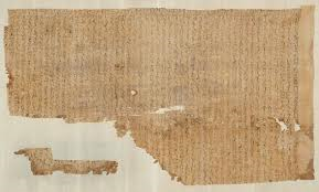
Up until this point many of the writing systems had been carved into stone such as the Rosetta Stone however in the later eras of Egyptian writing papyrus was used as a form of paper to be written on with a brush. This invention made it possible for written texts to be transported or moved from pace to place. There were many different grades of papyrus all being used in different situations. As papyrus grew commonly along the banks of the Nile River it was very inexpensive and therefore many people could afford to buy it for when they were buried with scriptures written on it to ask for the Gods’ good judgment. The image below is a shroud fragment covered in hieroglyphs of Tuthmosis III.