Wednesday, April 15, 2015

Modern Day Graphics - Video Games

            Now that I have discussed the evolution of graphic design from the beginning of the human race with cave paintings in France, to typography, up through eh Bauhaus, War propaganda and American design in New York we finally reach the main event for my studies in this class. My main focus at the University of Redlands has been to study the creation of video games in the hopes that I would one day be able to create my own gaming company. Video Games have had a very impactful presence in my life. It’s how I’ve connected with friends and connected with friends who have moved away from me. It is here and now that I am doing research on the history of videogame graphics and how they have evolved from the beginning until now.
            Contrary to popular belief the first video game was created back in the 1940s when Thomas T. Goldsmith Jr. and Estle Ray Mann created a rocket simulator on a Cathode ray tube. Back in the 1940’s however computers were very expensive and hard to come by and therefore computer graphics could not be developed for video games. Of course as soon as Apple’s Mac and Microsoft Pc came out people took immediately to creating video games with graphic displays. As the original operating system was the Disc Operating System or DoS for short the only graphical displays that could be produced were text boxes on a black screen. These games called Text based games are arguable considered the world’s first real video games however it depends on personal opinion on the definition of games themselves.
            By 1960 at MIT a group of hackers hacked into the schools revolutionary TX-0 computers and established a vector based game in which two player controlled ships were used to fight against each other on the screen. The game was called Spacewars! And it revolutionized the concept for video games. It was during this time that Ralph Baer would come in to create the world’s first every home console where games could be played in homes on peoples TV sets. TVs were not computers and so it was difficult to get a TV to generate graphics for people to be able to play in their living rooms. The result that Baer came to was to create logic circuits to send visual signals to the television and use the pixels of the screen to create images. These pixels were created in an 8-bit format and this 8-bit graphics were born. This format took hold to further develop into arcade games like Pac-Man and Donkey Kong, where the ever popular character Mario made his debut. From here the company Nintendo is developed and they take Mario to new heights with the establishment of the Super Mario Bros. This game created what would be called side scrollers where the game was made in a 2D format and the screen would scroll sideways as you moved your character to the edges of the screen. This would go on for years until Nintendo’s invention of the Nintendo 64 brining 3D graphics into play. 3D would play as the main graphic style for video games until just recently in 2012 when eighteen year old Palmer Luckey invented the virtual reality headset called the Occulus rift which brings in the future style of 4d virtual graphics.

            The Occulus rift is still not available for public release however youtubers like Markaplier and Tobuscus have been able to Beta test them with horror and adventure games. While this brings in a new style of graphics that are thus far unknown the future looks promising.


Paul Rand and IBM

As we move closer to our “Era of Stasis” as I will consider it from my last post, America became more and more driven into capitalist ventures. More and More companies have cropped up for different needs. Computers have made a huge stamp on the world’s history with the creation of Apple and Microsoft. The world is becoming much more technological with the introduction of Adobe who created Photoshop and Illustrator to help design new graphics in a more technological way. Of course with all these new inventions and companies inventing them, those companies will contract designers to create company logos for them. Here I will continue on my essay about Paul Rand and his creation of the IBM logo.

After helping the country revolutionize their graphic interests and design styles, Rand went on to focus on trademark logos in the 1950’s. He noticed that in order to be functional a company logo must be reduced to basic shapes that work no matter what color or size they are made. One must be able to immediately tell what the company’s logo is. His most famous logo was designed from Georg Trump’s typeface called City Medium for the company International Business Machines or IBM. This typeface held great response as the square negative space of the B showed the geometric and industrial feel that machines put off. Some years later he updated the logo by introducing horizontal lines that were to portray scan lines but also unify all three letters. About ten years after that he went on to create the “Eye Bee M” Logo using a simple human eye and a bee as the logos for the I and B. This design was used for his booklet called The IBM Logo: Its Use in Company Identification which showed that he had many more ideas if the IBM logo needed to be scrapped.


A Revolutionary Call - Paul Rand , Saul Bass

Now that the crisis of World War II had come to a close and production moving back towards lifestyle rather than wartime efforts, designs, primarily in America, had shifted into what can be considered temporary graphic design. Like Paris was to the late nineteenth and early twentieth centuries, New York City had been formed into the main hub for graphic design. Many of the first American designers were immigrants searching for a new life after the devastation of the war. America was a total capitalistic society with little to know artistic background. Because of this creativity and unique design was highly favored. Two designers stuck out and the greatest at harnessing this opportunity to put forth their designers: Paul Rand, and Saul Bass.
Historical figures’ lifestyles are of great interest to me. When I think about how the world used to work back in the days of the Renaissance and industrial revolution we were much more productive and willing to advance our world then we are now. What I mean by this is that when you look at someone like Paul Rand who had become a promotional and editorial designer for Apparel Arts, Esquire, Ken, Coronet, and Glass Packer by the age of twenty three, yet look at students know who are twenty one and we are barely trying to get the projects done to pass a class. In the words of one of my girlfriend’s professors, we have become “dormant.” Rand looked at artists like Kandinsky, Klee, and the cubists and took their designs styles formed his own and completely revolutionized publication design. If we take a look at one cover that Rand did for Direction magazine it shows the symbolic messages as well as visuals in his designs. He understood how to take universally known images and symbols and use them as guidelines and tools for conveying visual communication.
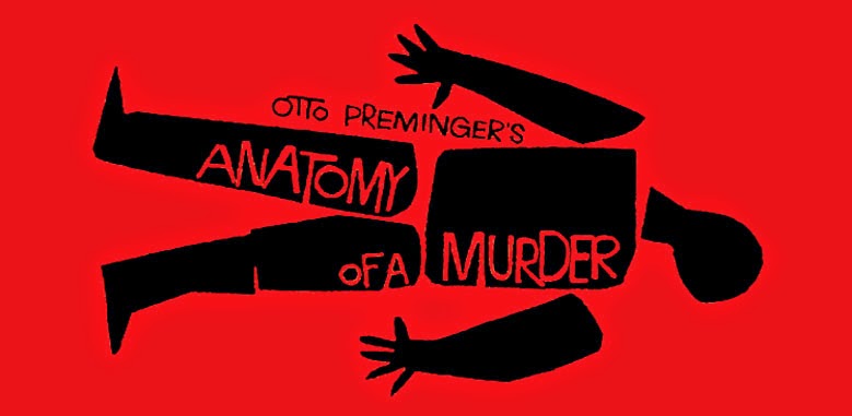
Much like Paul Rand, Saul Bass revolutionized art in Los Angeles after moving there from New York in 1950. Bass looked up to Rand and through the domino effect brought down the art styles of Kandinsky, Klee and others with him. However, where Rand used organized compositions and contrasted shape color and texture, Bass simplified his designs mainly to a single picture in order to convey his message. Bass had the power to take a highly complex illustration and pick out the main design and use it to press huge graphic power and design strength. Unlike Rand, Bass strayed away from the cubist’s style by using hand crafted and drawn illustrations with little to no text to put forth his messages.

In the end, I feel we should wake up and take after the designers of the past and start revolutionizing the world again. We are so focused and comfortable with our technology the way it is in the form of cellphones, video games, and television that we are complacent and unwilling to move out of the rut we put ourselves in. We need to look up to Paul Rand and Saul Bass and start defining art in new mediums and styles once again.


"The Art of War"

As the Bauhaus moved from Weimar to Dessau Germany tension around the world broke out caused by the previous World War. Communism took hold in Russia, turning it into the Soviet Union. Stalin led the rebellion still raging from Lenin’s Bolshevik party and started mass genocide around the nation. In Italy, Mussolini rose to power setting in place a new political system called fascism, a system that was very similar in ideals to communism. Japan became a heavy militaristic state and even invaded China brining many other allies to China into the mix. Pearl Harbor, the first international bombing on U.S. soil since the Revolutionary War brought America into the war. And of course Germany was enraged at the punishment dealt to them by the Treaty of Versailles after the First World War. Hitler rose to power leading Germany into a massive European domination with his Nazi Party.
With tensions high American graphic designers turned towards the war efforts with their designs. The main focus was propaganda and promoted production. Jean Carlu was one of the greatest designers of the time. After being commissioned by the U.S. Office of War Information he designed “America’s Answer: Production”. This poster would go on to be distributed all across the country and Carlu was awarded one of the Top graphic design awards from the New York Art Director’s Club Exhibition. Other designers like John Atherton, Joseph Binder, and E McKnight Kauffer were also of the illustrators commissioned to design for the war effort. Atherton decided to create posters Saturday Evening Post covers that acknowledged the threat of careless talk and gossip of enemy information among troops, while Binder and Kauffer were commissioned to design much more propaganda-esque posters such as posters for the U.S. Army Air Corps and Moral boosting posters for the Allied nations respectively.  
Another important designer during the war period was Herbert Bayer. Bayer was a designer straight from the Bauhaus in Dessau. He shifted design styles after his covers for PM magazine in the late 1930’s just before the war started. His new style was started in Dessau at the Bauhaus and brought forward during the war effort where he designed with realism in a very simple way. He then took his graphics and added in the information created a strong hierarchy to convey his messages. Bayer’s shift in design was extremely dramatic. We can see this when we compare his posters for the Kandinsky Jubilee Exhibition with his poster on Polio research. In the first design he was a young professor at the Bauhaus trying to popularize an unknown style of social order through photography. Meanwhile in his Polio research poster was the result of seeing the devastation left by the chaotic world war raging around the world while he was living in a place completely foreign to him. His style switched from photographed images with text to hand painted graphics and lettering with the same consistent hierarchy he had developed in Dessau.
After World War II had ended the United States turned their factories back from wartime efforts to consumer production and likewise the designs shifted with them. The CCA had decided to commission in a multitude of different artists for different series’. They started by commissioning a designer from each state to give the idea that wart and life were one in the same; a unified ideal. Next would be one of the greatest advertising campaigns in history. Elizabeth and Walter Paepcke joined with Mortimer Alder to entice designers from all over to create designs for great ideas of Western Culture.

Magazines were also being massively produced with Alexy Brodovitch on the forefront of it all. His skills in the editorial design world were unmatched and he had a hidden talent for taking in newcomers that would go on to become amazing magazine designers. Designers such as photographer Richard Avedon, and Irving Penn, and Art Kane. While this was happening however a competitor was arising named Herbert Matter who received contracts for Vogue, Fortune, and Harper’s Bazaar. Together with Brodovitch and later Giusti, magazine designes were fundamentally changed after the Second World War 

John Atherton

Joseph Binder

Herbert Bayer

Jean Carlu

Herbert Matter

Herbert Matter

Self Portrait

           As mentioned in my previous post we learned that typography had a major contribution to graphic design in the 1920's. So that we could get a better idea of what it was like designing new fonts and styles of typography we were design a self portrait of sorts in that we were to take our initials and design them into a custom made font. Because my favorite art style is cubism - art deco I decided to go for the more geometric approach. Here is the result: 


Wednesday, April 8, 2015

The Bauhaus Masters


            In my graphic design class we learn that one of the most important and crucial element of design is typography. Without typography your design cannot convey the message that the graphics are trying to put forth. Text and type had always been present in graphic design before however it wasn’t until 1919 at a design school in Germany, based upon revolutionizing design, called the Bauhaus did typography make its true importance known. The Bauhaus was the most significant subject of this course that stood out to me and really sparked my interest. I love the designs that came out of the art movement of the time and was really intrigued by many of the artists, however there were three in particular who caught my eye: Max Bill, Laszlo Moholy-Nagy, and Joost Schmidt.
            The original preliminary course instructor for the Bauhaus was Johannes Itten. Because of his profound goals for teaching his students he soon became the center of artistic education at the Bauhaus, believing that each student must find their true artistic abilities before settling for one medium. Soon however Bauhaus director Walter Gropius began questioning Itten’s design style which ultimately led to Itten’s downfall. His replacement was none other than Laszlo Moholy-Nagy. Moholy-Nagy was a Hungarian who came to the Bauhaus in the hopes of exploring painting, photography, film, sculpture, and graphic design. In his explorations he used many new materials such as acrylic resin and plastic as used new techniques such as photomontage and photogram, kinetic motion, light and transparency. Because Moholy-Nagy brought such great new forms of art to the Bauhaus he made a dramatic influence on the school and struck the interest of Gropius, promoting him to “Prime Minister of the Bauhaus.”
            As we discussed typography more and more in my class Moholy-Nagy’s typefaces and graphic designs really stood out to me more and more. He used a technique he called typophoto which was basically the beginning of modern graphic design in that it integrated text and image. Most graphics in design at the time were made by hand mostly through painting or drawing, however Moholy-Nagy criticized the painters of the Bauhaus by pressing the superiority of photography.
            As with all good things many people, particularly the government, in Weimar Germany had issued with the Bauhaus. In 1924 the Bauhaus was closed down and director Gropius urged it continue in Dessau. In the fall of 1926 the school was indeed moved and reopened at a new complex in Dessau. One such student who moved to the Bauhaus for his studies was Max Bill. At the Bauhaus Bill’s studies focused on painting, architecture, engineering, sculpture, and product and graphic design. It wasn’t until he left school however that his work began to become recognized. Bill began by designing buildings however it was his product designs that came first, most notably his stool that could be used as either a shelf or a bedside table as well. Many people were so taken by Bill’s architecture work that he was contracted to design the Bauhaus Archive in Berlin and the Museum of Contemporary Art in Florence. Much like the other two designers Joost Schmidt was also a graphic design student from the Bauhaus however not much was said about him other than he designed a poster for the Bauhaus in Weimar Germany.
Laszlo Moholy-Nagy

Laszlo Moholy-Nagy

Laszlo Moholy-Nagy


Max Bill

Max Bill

Max Bill


Joost Schmidt

Joost Schmidt

Joost Schmidt

Thursday, April 2, 2015

Constructivism and De Stijl

            With World War I come and gone, cubism started branching off into multiple subgenres. During the 1920’s Russia was undergoing many changes to its political structure, through civil war between the Czar loyalists and the Bolsheviks’ Red Army. Despite the civil turmoil erupting all across the country, creativity blossomed and changed much about how graphic design stands today. Russian avant-garde artists quickly adapted to cubism and futurism and found common themes that resonated between the two. With these common themes they created a subgenre called cubo-futurism which experimented and focused a lot on typography.
            During the time frame that artist Vladimir Vladimirovich Mayakovski was working with ROSTA an artists named Kasimir Malevich was founding his own style of artwork that he called suprematism. Suprematism took cubo-futurism a step further, rejecting all representations and simply using expression to connect with people. Malevich once said that art should be an “expression of feeling, seeking no practical values, no ideas, no promised land.”
            Color became a very important issue to deal with for artwork of this time. Malevich firmly believed that color and form were the two most crucial points of artwork and should be the most effective elements of design. This same idea was held with the artists of another new style of artwork called De Stijl from Netherlands in the summer of 1917. It was founded by Theo van Doesburg who later collaborated with Piet Mondrian, Bart Anthony van der Leck, and Pieter Oud. They created a style of artwork for the movement that closely related to Malevich’s in the sense that cubism played a major role through abstract geometric shapes. What really set off De Stijl from its former movement was its use of color. It used color as a structural element alongside geometric shapes, for example red was a very strong contrasting color symbolizing rebellion and was therefore used often in printing and graphic design.
            De Stijl also made its way into architecture where artists like Van Doesburg and Gerrit Reitveld were designing and constructing buildings that were extremely profound. Doesburg was using De Stijl to design shapes with asymmetrical marriages. Meanwhile Rietveld designed the Schroeder House which was very radical for the time. So radical in fact that neighbors threw rocks and the children living there were taunted and made fun of by classmates.
            Before the war had finished Cubism had taken hold in and were widely favored in Russia and the Netherlands yet there was the gaping split in design in between both countries. After the War had ended however the bridge between the two was being built as smaller countries like Czechoslovakia, Hungary, and Poland adopted these styles. One such artists influenced by De Stjl was Henryk Berlewi. In Germany Berlewi felt that design had been killed with illusions that proved to be major downfalls in his opinion to modern art. He then pushed his theory of mecho-faktura in which he “mechanized painting and graphic design”. In doing this he eliminated any three dimensional features he believed were prevalent in the artwork around him. From here his work was introduced into the Polish community where it later reached into Russia to connect the gap that had been opened by the War.
Black Square - Malevich

Kasamir Malevich

Kasamir Malevich
Henryk Berlewi
Henryk Berlewi
Henryk Berlewi
Henryk Berlewi

Kasamir Malevich


Tuesday, March 10, 2015

Art Deco and War Posters

           Cubism continued its influence into the 1920’s and 30’s becoming what is today known as art deco. During the time period in between World War I and World War II traveling was being majorly promoted across America and Europe. Many graphic designers of the time used art deco to create posters for railways and the London Underground, as well as cruise lines and travel poster by plane. Three designers of the time really stood out to me and I found myself being captivated by their artwork: Kauffer, Carlu, and Cooper.
           Edward McKnight Kauffer lived a troubled childhood that led to him traveling to the Art Institute in Chicago and then eventually to Europe to study graphic design. In 1913 while studying in Chicago a New York Times article forced Kauffer to rethink his time at the Art Institute, which resulted in his decision to move to London where he designed many war posters. His Poster Daily Herold poster is credited to be flawed in the text, however his graphic is so inspirational it caught the attention of Winston Churchill who contracted him to design the emblem for the Royal Flying Crops. Aldous Huxley responded to Kauffer’s designs that they contradict many graphic designs of the time that carry into today’s modern advertisements flaunting money and sex as a means to grab attention. I find this to be extremely refreshing and a great tool for a designer to be able to use in their work.
Like Kauffer Jean Carlu also had a hard early life. At age eighteen he fell under a trolley car which severed his arm and forced him to learn to draw with his left arm. This proved to be a great challenge that he quickly overcame as World War I approached and he gave up his dream of architecture to apply his visual communicative skills to designing War propaganda for his France. The science mentality he had for architecture helped him to develop his designs in the art deco style. He used sharp and rigid lines to indicate tension and alertness but used curves and soft edges as breathing space signifying relaxation.
            In England during this time Austin Cooper continued the tradition of art deco after using collage designs to ignite emotional attachment and memories by compiling different cutouts of landmarks. In 1924 Cooper shifted completely into art deco by designing completely in geometric shapes and color to help further develop communication posters for the London Underground.
Edward Kauffer

Edward Kauffer

Edward Kauffer

Jean Carlu

Jean Carlu

Jean Carlu

Austin Cooper

Austin Cooper

Austin Cooper


Monday, March 9, 2015

Cubism

           Cubism has had a major role in my interest in art starting from a very young age. I come from a family of engineers and have a mother who studied art history herself so the combination of geometric patterns and shapes mixed into artwork has always fascinated me. Next to Monet and Van Gough, Picasso is one of my favorite artists. It was his work that started the cubist movement which challenged the organic design style of the Renaissance that had been prevalent for the last four hundred years. What influenced Picasso to begin to paint in this style was the geometry that was seen in African and Iberian sculpture, and fabrics. Cubism allowed designers challenged space and human emotion thru a whole new lens, by separating figures into geometrical frames the cubist artwork had multiple shapes that were visible from different angles.
           In 1910 Picasso took cubism to a new level with fellow artist Georges Braque, the two created analytical cubism. Picasso and Braque made it an intention to look at the artwork from multiple viewpoints and manipulate the artwork so that the shapes would appear from multiple viewpoints. The differences between cubism and analytical cubism are subtle but prominent; analytical cubism makes manipulating multiple viewpoints deliberate while it is simply a byproduct in cubism. Analytical cubism lasted until 1912 when Picasso and Braque introduced collage work into their design. Texture became a huge part of cubism with the influence of collage work as the pieces of collage work could signify certain objects while the painting itself could provide the color and background shapes as needed. Typography and letterforms often came into play in the new evolved Cubism, they were used to emphasize meaning more often than not.
In 1913 the art movement took a much simpler turn with synthetic cubism. This style focused more around characteristics and visuals of artwork rather than putting meaning to paper. Artwork such as Juan Gris’s Fruit Bowl 1916 is such an example of this. Gris became a very important figure in synthetic cubism; his work acting as a middle ground to geometric patterns and perception. Around this time cubism was taken away from the sharpness of past cubist’s and centered around shapes with curvature such as cones and spheres. Fernand Legar and Paul Cezanne attested to this style by advising artists to “treat nature in terms of the cylindrical, and the sphere and the cone” (Cezanne).
            Cubism was the first of many new art styles to crop up around the twentieth century due to new rises in technology. It was because of this movement that artists started connecting geometric patterns to art that paved the way for other greatly impactful styles such as futurism, dada, surrealism, and expressionism
Pablo Picasso (1881-1973) 'Factory, Horta de Ebbo', 1909 (oil on canvas)

Pablo Picasso (1881-1973) Girl with Mandolin (1910)

Juan Gris (1887-1927) Fruit Bowl, Vintage Cubism Art Print